CSS
How to blur text with CSS?

In this article, we will learn How to blur text by using CSS properties.
The blurred text is the text that is not visible clearly to the user. It displays in a unique form as compared to the normal text.
It is usually provided to the user to keep the text hidden from the user or it might also be used to create a mystery for the user.
How to blur text with CSS?
We can blur text with the help of 2 CSS properties, one is the text-shadow where we provide some shadow to the text and another one is the color property that we keep as transparent.
Both these properties will work together and the result will be the blurred text.
Let’s jump into the code to see the practical example with our eyes:-
CSS :-
    .blur {
       color: transparent;
       text-shadow: 0 0 4px #000;
    }
HTML :-
    <p>This is a Normal text.</p>
    <p class="blur">This is a Blur text.</p>
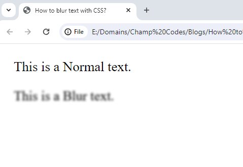
Output :-
In the CSS syntax, we have created a class with the name as blur, used the property color, and given it the value as transparent. Further, we have used the text-shadow property and given a shadow of 4 pixels with color back.
In the HTML code, we have created two paragraphs. The first paragraph includes some text whereas the second paragraph also has some time & additionally class blur is applied to this paragraph.
In the resulting image, the first paragraph can be seen with the normal text visible in the usual format whereas, on the second line, the text is seen blurred because of the class applied to it.
Recap
We conclude here with a note that we have easily learned the CSS for displaying the text in blurred format.
We hope that this article has helped you in learning some CSS code.